Japanese Branding Inspiration: From Zen Minimalism to Bold Expression
If you've ever found yourself wandering the streets of Tokyo, Kyoto, or any Japanese city, you've likely experienced branding nirvana. During my recent trip to Japan, I was constantly struck by the masterful way Japanese brands communicate their identity – often without saying a word. Let's explore these branding lessons that any Buffalo business could apply, regardless of industry.
The Power of Purposeful Minimalism
In the West, we often equate effective branding with filling space. More information. More design elements. More, more, more. Then you step into a MUJI store in Tokyo, and suddenly, less isn't just more – it's everything.
Japanese minimalist branding isn't about being sparse for aesthetic reasons alone. It's about confidence. When a brand knows exactly what it stands for, it doesn't need embellishment. Clean lines, ample white space, and a limited color palette force brands to identify what's truly essential.
Small Business Takeaway: Could your visual identity benefit from some intentional subtraction? Sometimes removing elements makes what remains more powerful. Next time you're designing something for your business, try removing one element you initially thought was necessary.
Typography as Visual Storytelling
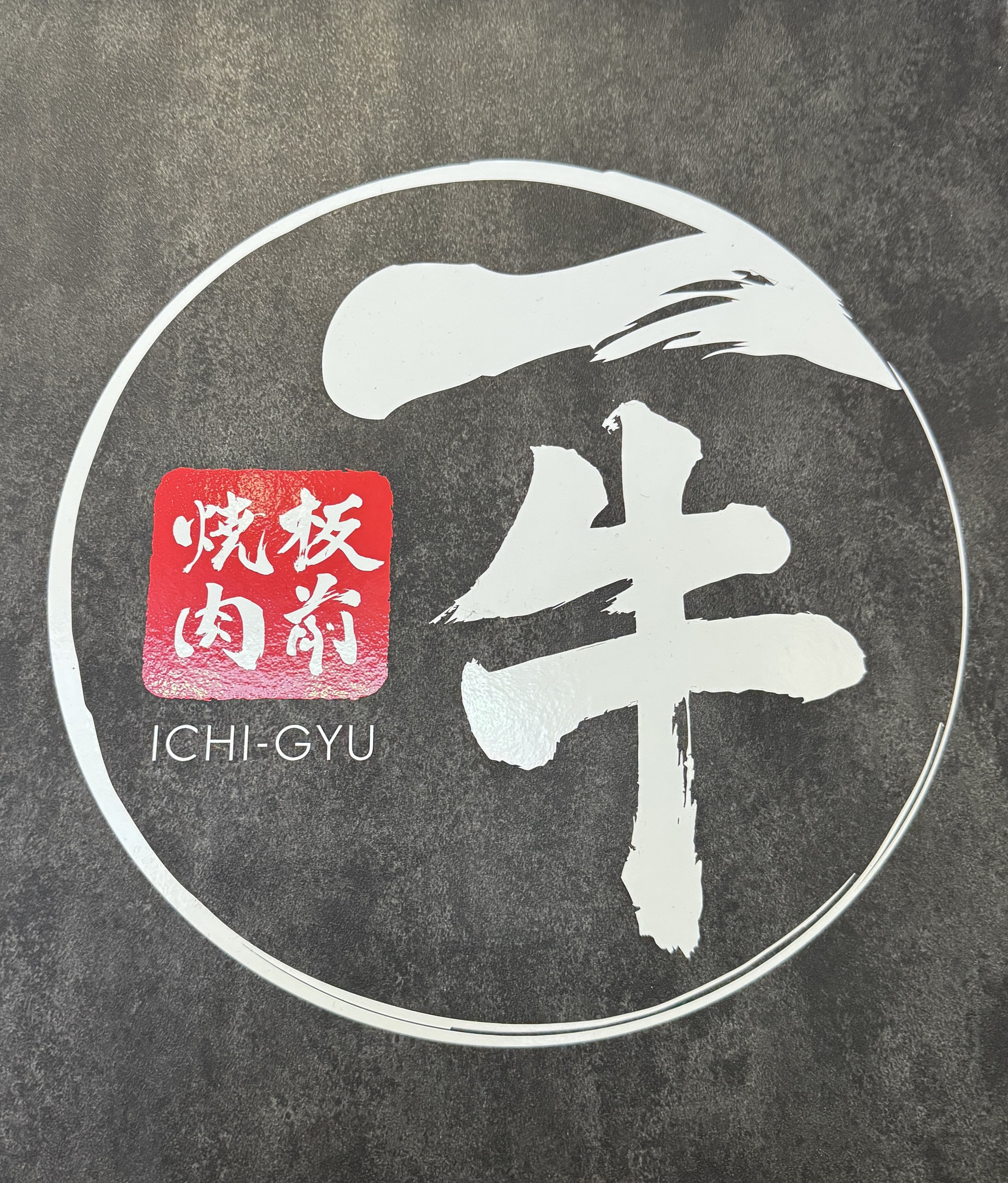
Even if you can't read a single character of Japanese, you can feel the difference between the typography on a high-end Ginza boutique and the electric signage in Shibuya. Typography in Japan isn't just about readability – it's about evoking feeling.

What fascinated me was seeing how the same characters could communicate entirely different brand personalities based solely on their treatment. Traditional brush-style characters for a century-old tea shop convey heritage and craftsmanship, while the same characters rendered in neon speak to modernity and energy.
Small Business Takeaway: Your font choices are doing the heavy lifting in your brand identity. Are they aligned with the feeling you want to evoke? Remember that consistency matters, but so does purposeful contrast. Limit your brand to 2-3 typefaces that complement each other while serving different functions.
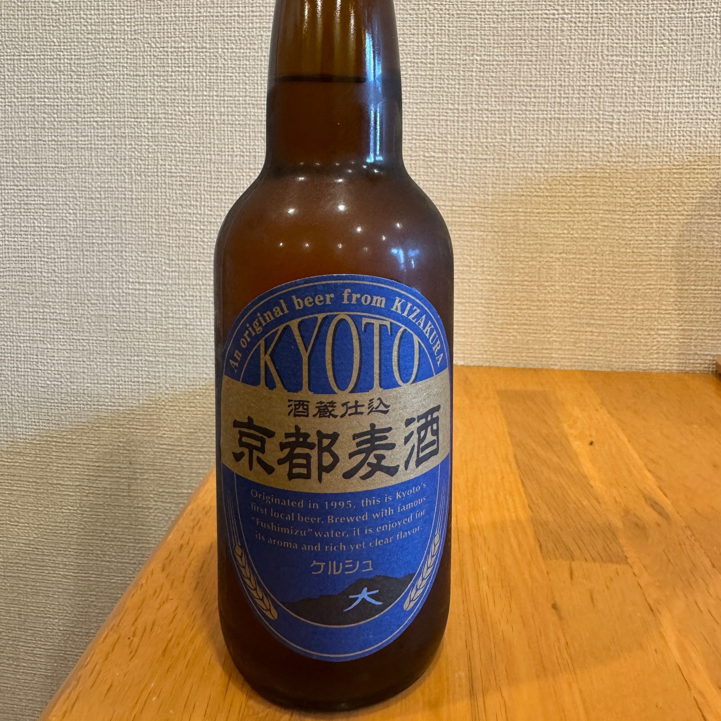
Strategic Color Psychology
Japanese brands demonstrate remarkable intentionality with color. From the serene indigos and warm woods of traditional spaces to the electric pinks and yellows of Harajuku fashion, color is never an afterthought – it's strategy.
What's particularly impressive is how Japanese brands leverage cultural color associations. Navy blue and white not only look clean and timeless but evoke traditional indigo dyeing techniques. Wabi-sabi inspired brands embrace muted, natural tones that connect to earthy ceramics and weathered textures.
Small Business Takeaway: Beyond just picking colors you like, consider what they communicate in your cultural context. Blues build trust, reds create urgency, yellows grab attention. How can your color palette work harder to telegraph your brand values?
Mascot Marketing Mastery
Perhaps nothing surprised me more than seeing serious financial institutions and government offices represented by adorable cartoon mascots. Kumamon (Kumamoto Prefecture's rosy-cheeked bear) generates millions in revenue while building regional pride. The Tokyo metro has playful characters guiding commuters.

These mascots (known as yuru-chara) create emotional connections where words might fail. They humanize organizations, simplify complex messages, and create memorable impressions that linger long after factual information fades.
Small Business Takeaway: You don't need a full-blown mascot, but could your brand benefit from more personality? Even serious B2B companies can find appropriate ways to inject character through illustrations, consistent photography styles, or recurring visual motifs.
Packaging as Experience Design
In Japan, packaging isn't an afterthought – it's part of the product experience. From the elaborate ritual of unwrapping a pastry box to the ingenious functionality of a bento container, packaging extends the brand story.
I watched a sales associate wrap a simple purchase with such care and precision that it transformed a transaction into an experience. The packaging communicated "what's inside matters" without saying a word.
Small Business Takeaway: How do customers physically interact with your brand? From your email newsletter layout to your business card texture to your packaging materials, every touchpoint is an opportunity to reinforce who you are. Identify one customer touchpoint that could benefit from more thoughtful design.
Balancing Tradition and Innovation
The most compelling Japanese brands find ways to honor cultural heritage while embracing progress. A centuries-old sake brewery might pair traditional production methods with striking contemporary bottle designs. A tech company might house cutting-edge products in packaging that references traditional paper-folding techniques.
This balancing act creates brands that feel both timeless and timely – rooted yet relevant.
Small Business Takeaway: What's your brand heritage? Even newer companies have origin stories. How can you honor where you've come from while pushing into where you're going? Your history and future don't have to be at odds with your branding.
The Confidence to Stand Out (or Blend In)
What ultimately ties together Japanese branding – whether minimalist or maximalist – is confidence. Brands know exactly who they are and who they're for. Some whisper while others shout, but all do so with intention.
From a tiny ramen shop with nothing but a curtain in the doorway to a vibrant streetwear brand covered in graffiti-style graphics, successful Japanese brands don't try to appeal to everyone. Their clarity attracts their ideal audience.
Small Business Takeaway: The most compelling brands have the courage to be distinct. Are you trying to appeal to everyone and ending up memorable to no one? Clarifying who you're not for can be as important as knowing who you are for.

Bringing Japanese Branding Wisdom to Buffalo
You don't need to book a flight to Tokyo to apply these branding principles (though I highly recommend it if you can!). The essence of excellent Japanese branding – intentionality, attention to detail, and confidence – can transform how Western New York businesses approach their visual identity.
Whether your brand sensibility leans more toward serene minimalism or vibrant expression, the key is consistency and purpose. Every visual choice should reinforce who you are and what you stand for.
Ready to bring some of this Japanese branding magic to your business? Vagari Creative specializes in helping Buffalo small businesses develop brand identities that stand out in meaningful ways. Let's chat about how we can apply these principles to help your business tell its unique story.